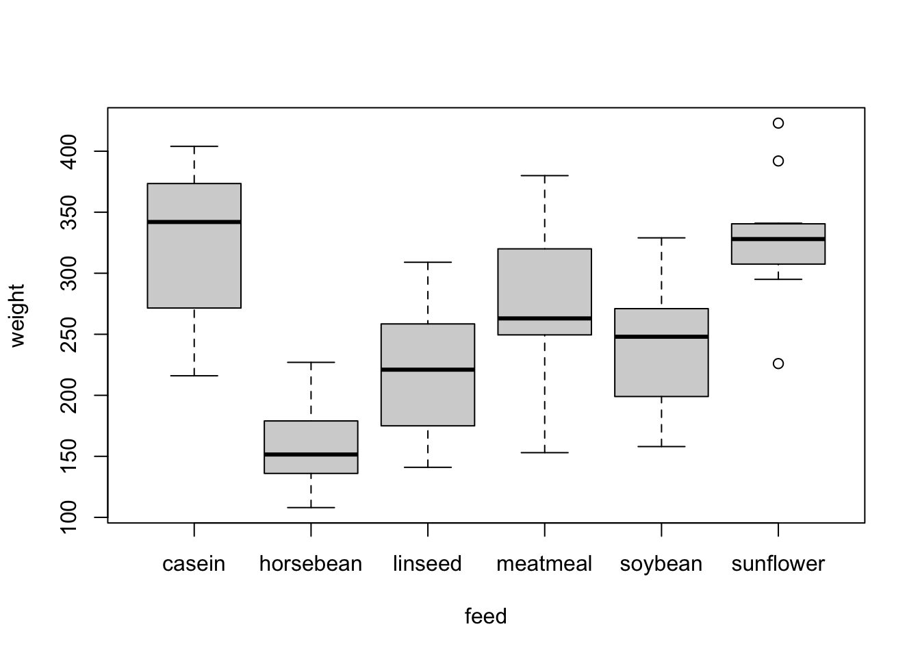
Problem 1
There is a built in dataset called chickwts, which records weights of baby chickens fed on different kinds of diets.
Make a prettier, publication ready version of the plot below, using the ggplot() function from the ggplot2 package.
DON’T USE THE qplot() SHORTCUT, USE THE FULL ggplot() FUNCTION
Make sure you do the following:
- reorder the x axis so the different feeds are in order from lowest to highest median chick weight
- apply a fill color to the boxplots (making each feed type a different color) so they look prettier
- include a legend telling me which feed corresponds to which boxplot color.
- add an informative title to your plot
- customize at least one aspect of the plot’s theme
Problem 2
Using
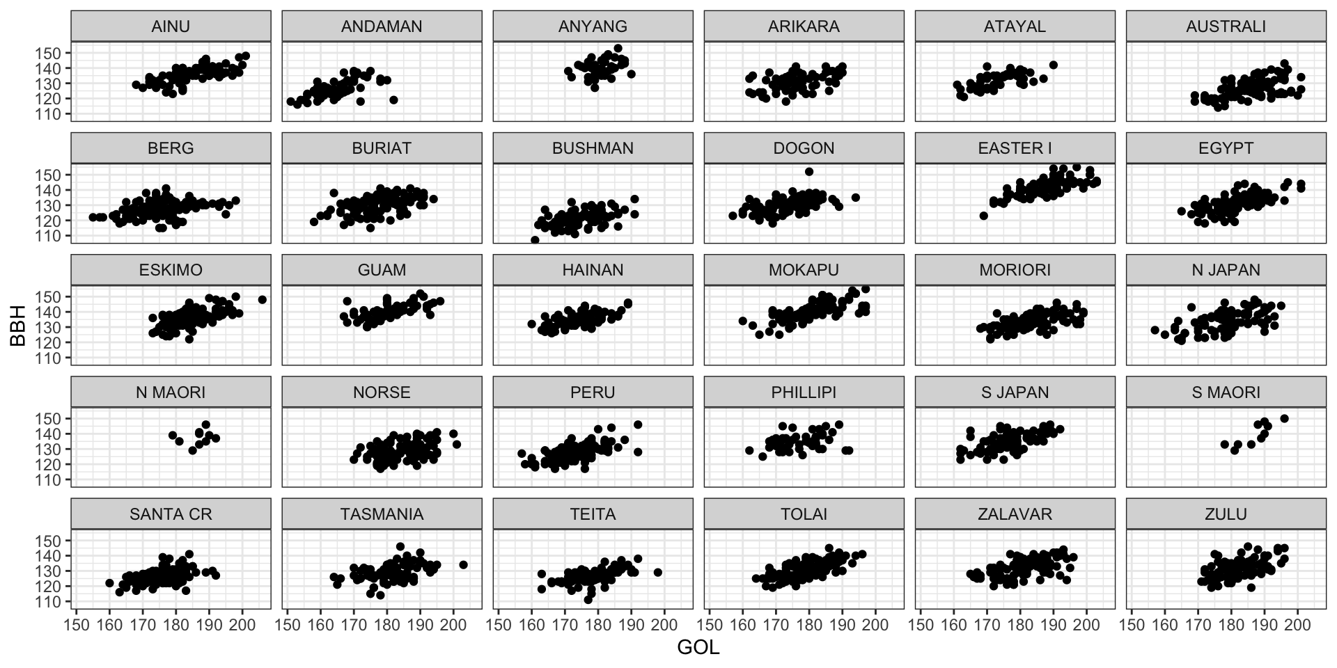
dplyr, and the Howell’s craniometric dataset calculate the mean of the GOL, XCB, ZYB and SIS measurements for each population group by sex. (i.e., calculate the mean value separately for NORSE males and NORSE females, and likewise for all groups). The resulting data frame should only have 6 columns. (one each for sex and population, and one for each of the 4 measurements).Recreate the below figure exactly (including the theme) using the full cranial dataset. Note: you can control the size of the figures in your knitted document by including options in the code chunk. The default size is 6 for width and height. The figure below is 10 wide and 5 inches high, which I changed using the following R Markdown options:
```{r fig.width=10, fig.height=5}
#code to make the figure here```